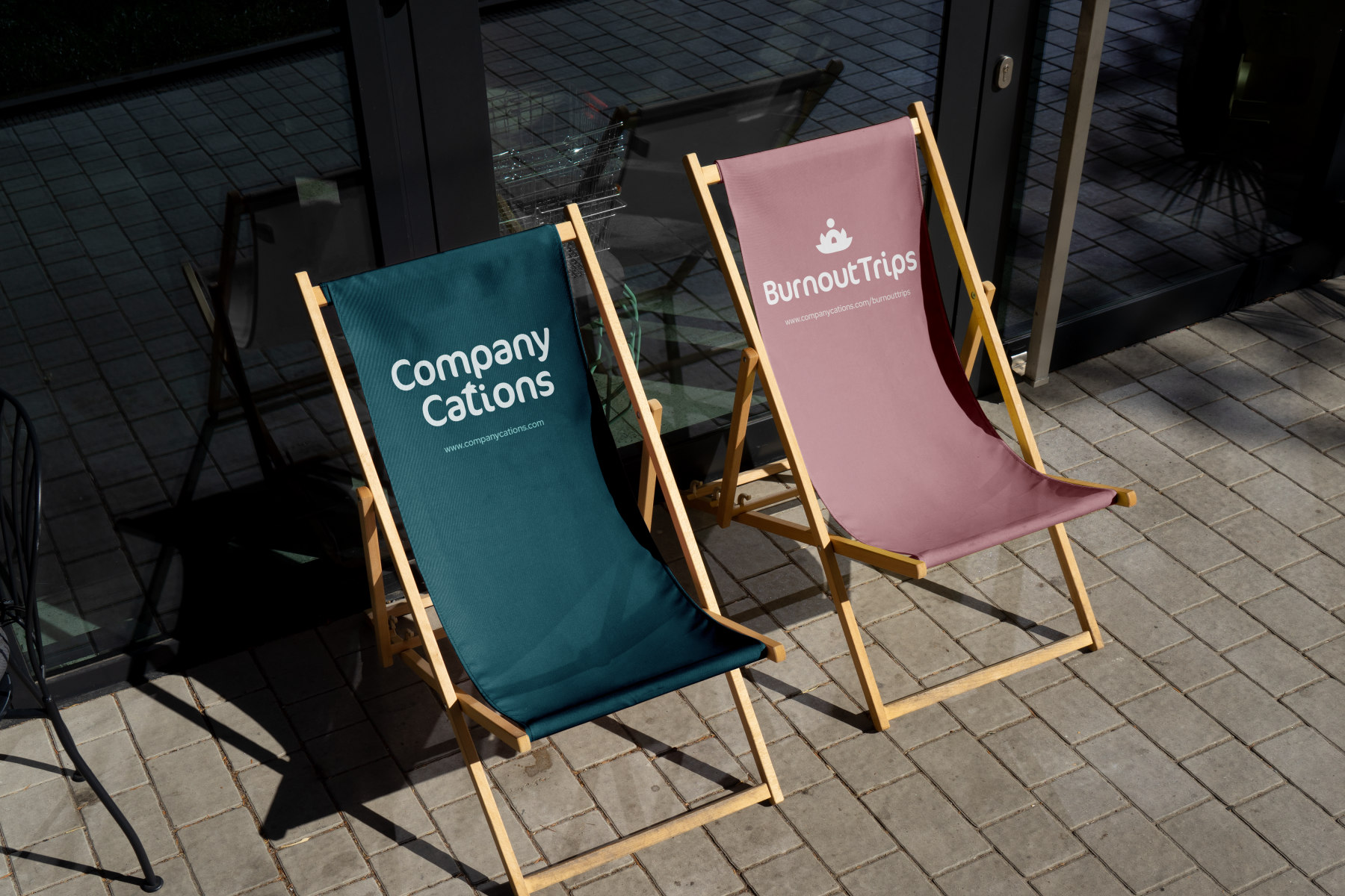
Over the centuries, luxury has always been associated with the possession of beautiful, often unnecessary things. In the modern history of men, this concept has gone through a very long time and conceptually evolved from excessive, wasteful consumerism, through an extravagant indicator of status, to the unique value of lived experiences.
Today luxury means value instead of possession. This perspective set our design direction while working for the Latre Luxury brand.
Quality over quantity is the guiding principle of collecting experiences that count. We describe luxury in three words: slow, disconnected and present.
The Latre Luxury is a new concept and definition of luxury
It combines three related fields: art, travel and real estate, and most importantly, the brand was created from the passion and years of experience in the above industries of its founders.
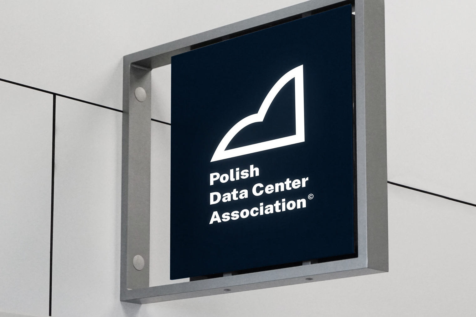
The proposed logotype is designed to combine subtlety and classic, timeless beauty. The color palette was based on gray and navy blue to give due solemnity, elegance and emphasize the high level of concierge services.
The logotype
main logotype
logotype construction
short version
Typography
Headings: Kumbh Sans Light
The history behind Lorem Ipsum
Subheadings: Kumbh Sans Bold
The history behind Lorem Ipsum
Paragraphs: Albert Sans Light
Lorem Ipsum is simply dummy text of the printing and typesetting industry. Lorem Ipsum has been the industry's standard dummy text ever since the 1500s, when an unknown printer took a galley of type and scrambled it to make a type specimen book. It has survived not only five centuries, but also the leap into electronic typesetting, remaining essentially unchanged. It was popularised in the 1960s with the release of Letraset sheets containing Lorem Ipsum passages.
Color Palette
BLUE WHALE
#1B3647
C89 M70 Y50 K46
R27 G54 B71
BLACK PEARL
#0A1624
C85 M75 Y56 K73
R10 G22 B36
VULCAN
#3D3E40
C68 M62 Y59 K48
R61 G62 B64
GREY CHATEAU
#9B9DA0
C42 M33 Y33 K0
R155 G157 B160
QUARTZ
#E2E2E3
C9 M8 Y7 K0
R226 G226 B227