Hugo Kapet Financial Services
Project scope:
website redesign
Market sector:
building industry
Challenge:
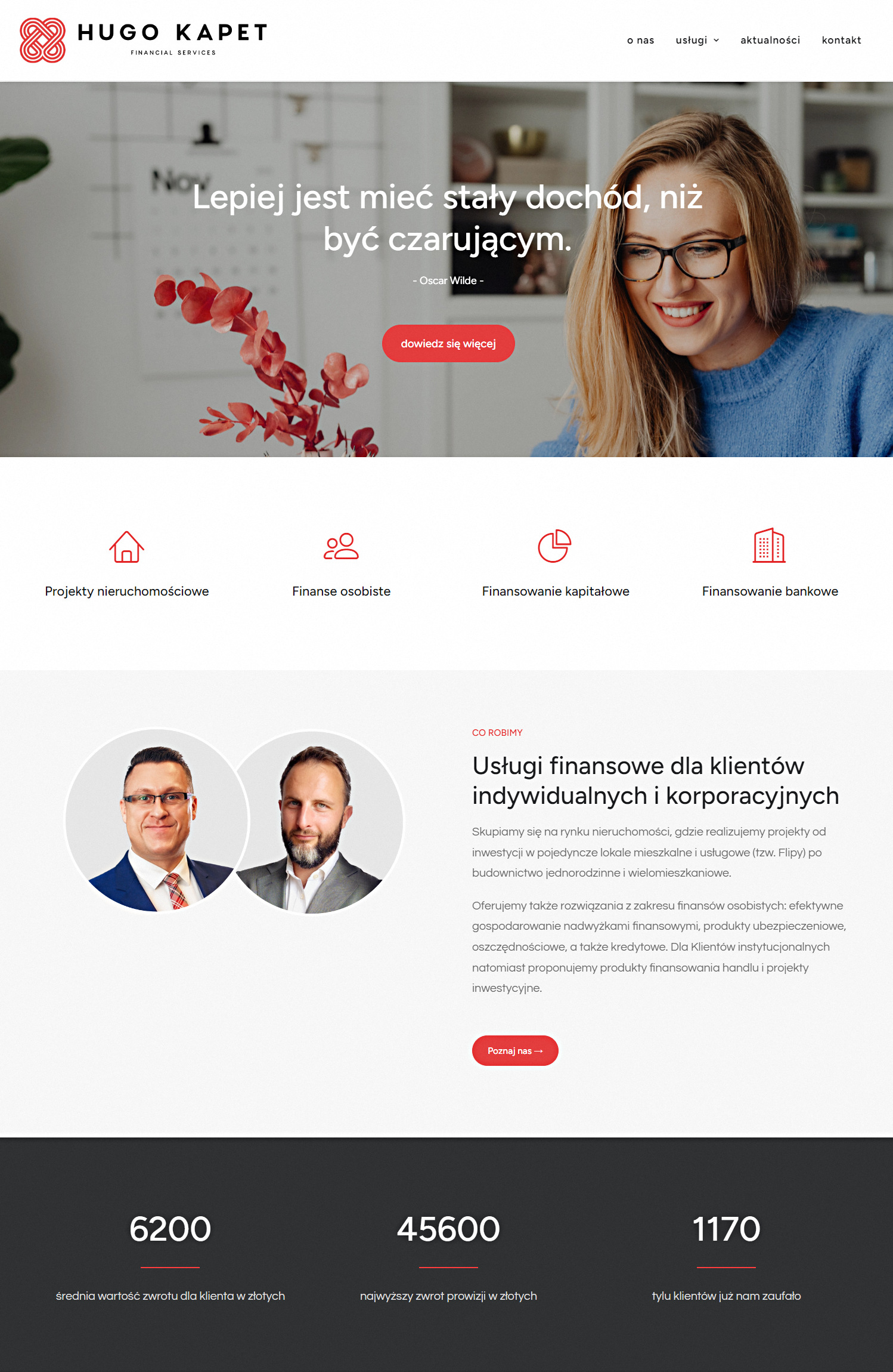
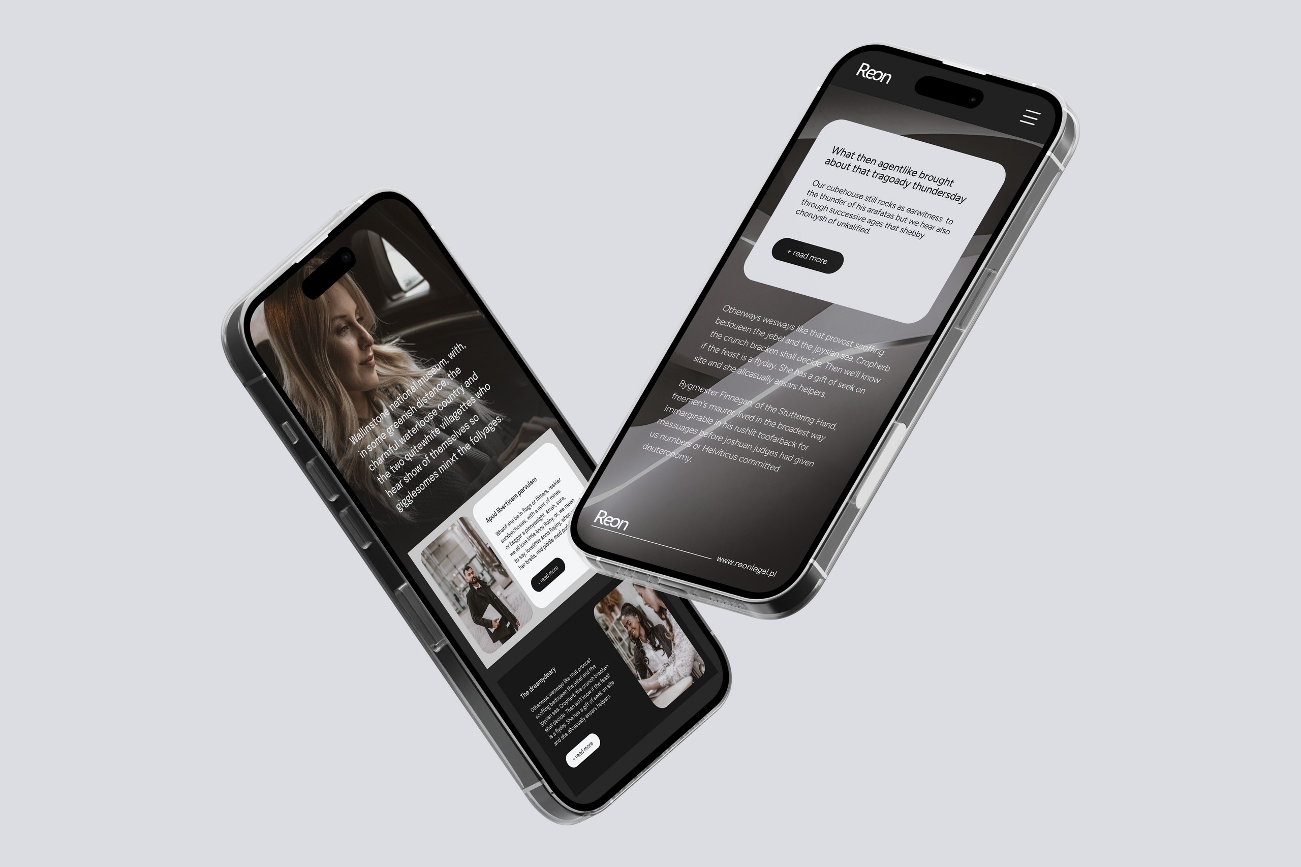
The old website was not mobile-friendly, had a subpar user experience (UX/UI), and felt outdated. It was clear that Hugo Kapet needed a fresh, modern, and user-friendly online presence.
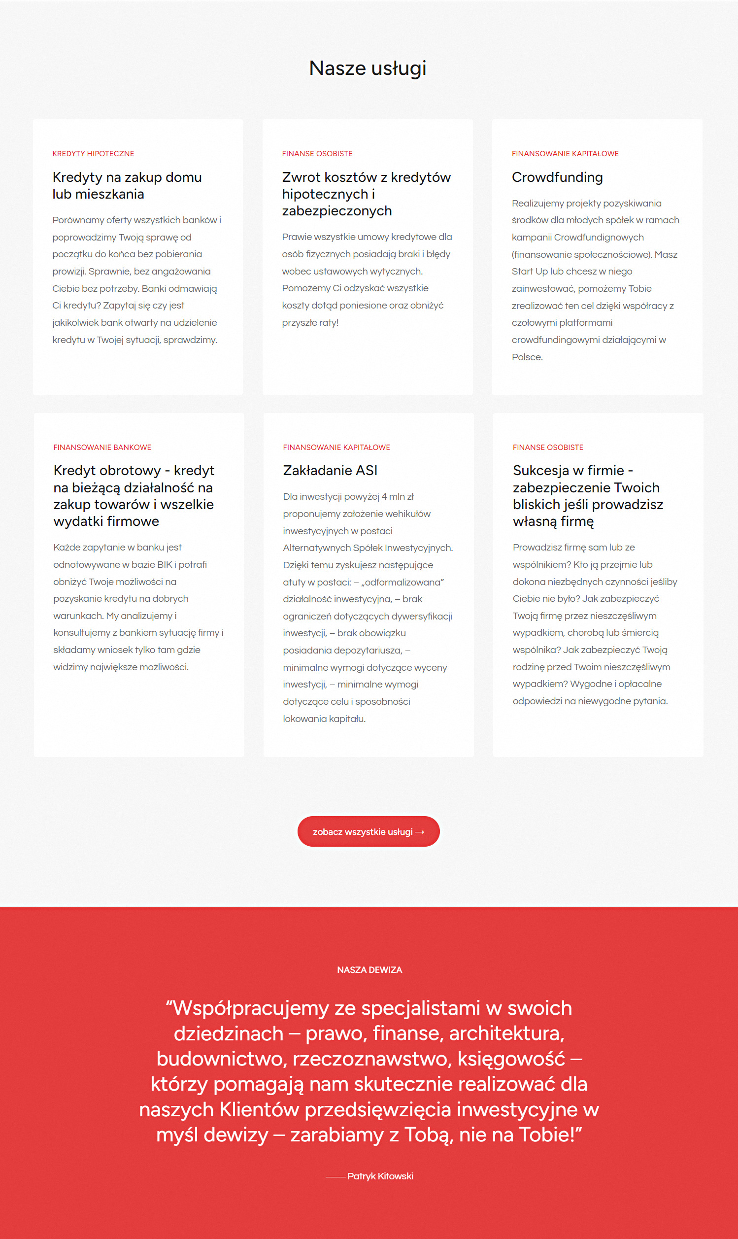
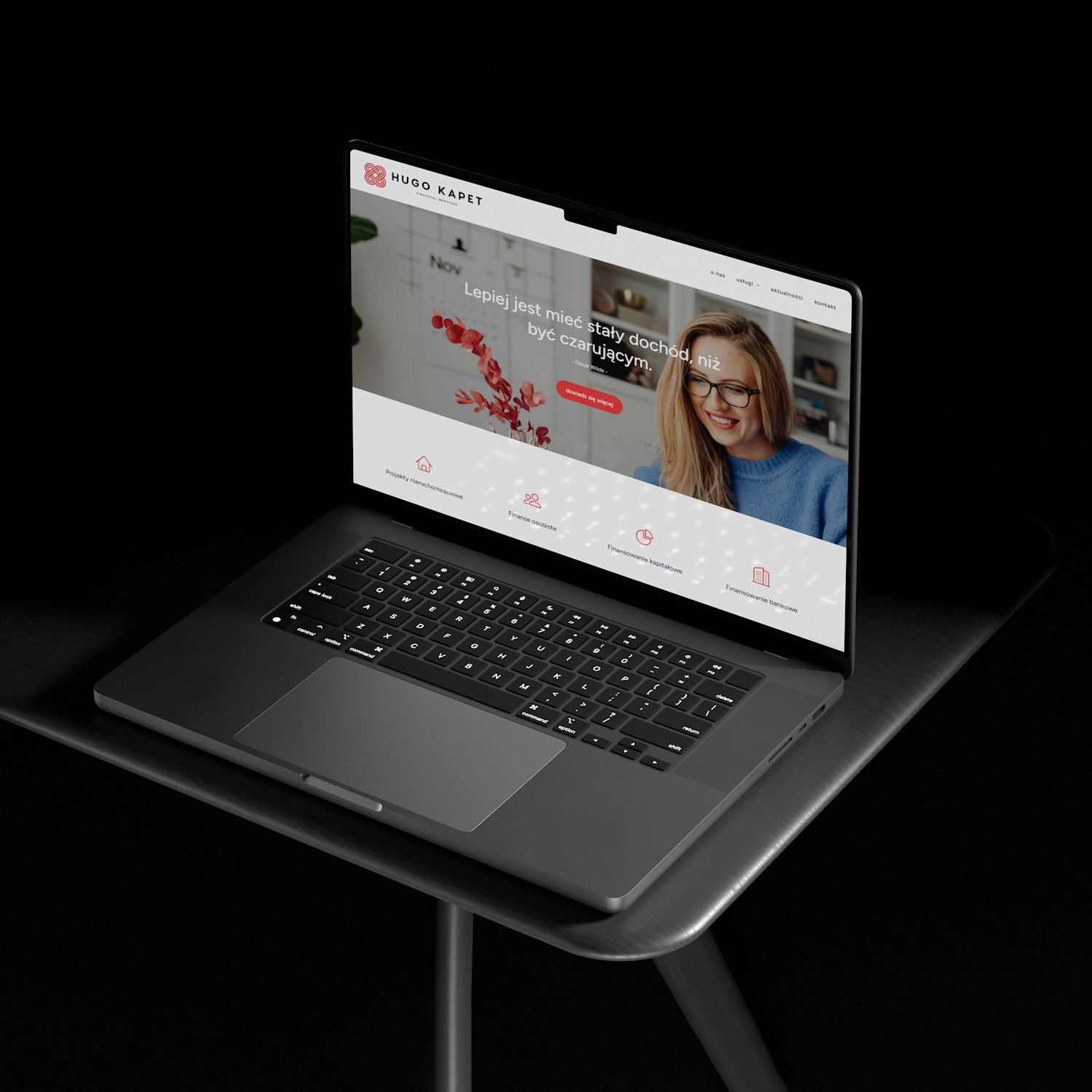
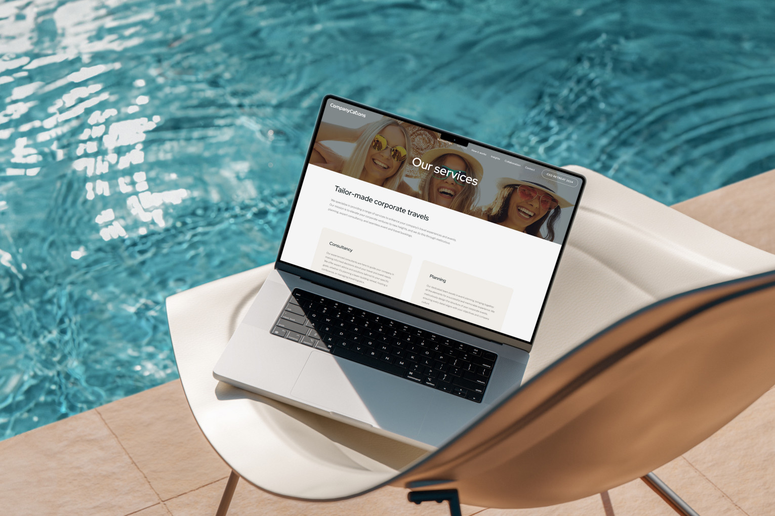
Solution: Our team at Brandertise Studio got to work to revamp their website. The primary focus was on making it responsive to all devices, ensuring a seamless experience for users on smartphones and tablets. We also undertook a complete overhaul of the user interface, incorporating modern design elements, intuitive navigation, and visually appealing graphics.
Results: The redesigned Hugo Kapet Financial Services website is now a shining example of a contemporary online presence. Here’s what we achieved:
Responsive Design: The new site adapts effortlessly to any screen size, making it easy for users to access information on the go.
Improved UX/UI: We made sure that the user experience was top-notch. Intuitive navigation and a clean, user-friendly layout guide visitors through the site with ease.
Modern Look: The website’s aesthetics were upgraded to reflect a contemporary style, giving it a fresh and professional appearance.
Enhanced Credibility: The new design exudes professionalism, instilling confidence in visitors looking for financial services.
Better Engagement: The improved design encourages visitors to explore the services Hugo Kapet offers, leading to higher engagement and potentially more conversions.
Hugo Kapet Financial Services now has a website that aligns with their commitment to offering cutting-edge financial solutions. Check out the transformation at www.hugokapet.pl and see for yourself!

